ShopDreamUp AI ArtDreamUp

Deviation Actions


Suggested Deviants


Suggested Collections


You Might Like…


Featured in Groups
Description
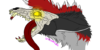
"The opposite of war isn't peace -
The opposite of war is creation"
I'm not sure where I got this quote from, possibly on youtube on Dr. Steel's videos.
once again I need your help guys. This is gonna be something for my portfolio.
The Text "War" is kind of drowning in the surrounding area and needs a bit more highlighting. Other than that I'd like to know:
is it readable, or does it look rather confusing? What's your impression? How do you feel if you see this, what are your thoughts? What do you think is the message of this?
War is represented by the blood splatters and aggressive looking texture, and creation, as in artistic creation, represented by the color splatters and the canvas like texture. So far I still need to work on the green text and apply texture or a color gradient to it.
I just want to know if I can continue the work like that. Any suggestions or ideas are welcome too
Oh also possibly my first typography thing I ever made. But not even sure if it actually is typography lol....
Image size
952x1001px 1.68 MB
© 2010 - 2024 hail-the-oblivious
Comments15
Join the community to add your comment. Already a deviant? Log In
This is pretty nice, I didn't expect to see something like this, but you can do so many styles well, and the deep thought behind this is surely like you. ^^ Not really confusing, I can read it just fine. Kind of reminds my of creation over destruction or so, but it could be taken in a few other ways I think.  (Smile)") Good stuff.
Good stuff.